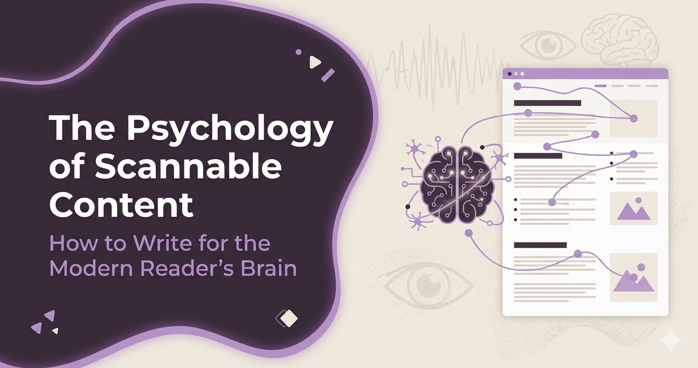
The psychological tricks to formatting text so a tired human brain actually finishes it.
Let’s be honest for a second: you aren’t actually reading this blog post.
Well, at least not the way people used to read. Your eyes are likely skimming the page, jumping from the bold text to the bullet points, deciding in a matter of seconds whether it’s worth slowing down to read the full sentences.
Don’t worry, I’m not offended. As a content writer and a psychology student, I actually expected it.
The way we consume information online has fundamentally changed. We no longer read web pages like chapters in a novel; we scan them like billboards on a highway. If you are writing content for a website or a business, understanding the science behind how people scan isn’t just a neat trick—it’s the difference between captivating an audience or losing them to the back button.
“The art of writing is the art of discovering what you believe.” Gustave Flaubert
In the digital world, we can take that a step further: the art of online writing is discovering how to present those beliefs so a tired, distracted human brain can actually digest them.
Here is the psychological breakdown of why modern readers scan, and how you can format your content to play with human nature, not against it.
1. The Battle Against “Cognitive Load”
In psychology, cognitive load refers to the total amount of mental effort being used in the working memory. Think of your brain’s working memory like a computer’s RAM. If you open too many browser tabs at once, the computer slows down.
When a reader lands on a blog post and sees a massive, unbroken wall of text, their brain instantly calculates the cognitive load required to read it. The verdict? Too much work.
When paragraphs are too dense, a phenomenon called visual fatigue kicks in. The reader’s brain gets overwhelmed, anxiety spikes slightly, and they click away.
How to fix it:
- Keep paragraphs short: Aim for 1 to 3 sentences maximum. Give the reader’s eyes a physical “breather” on the page.
- Embrace white space: White space isn’t empty space; it’s a psychological visual cue that tells the brain, “Relax, this is easy to handle.”
2. The F-Shaped Pattern and the Science of Eye-Tracking
Years ago, the Nielsen Norman Group conducted a famous eye-tracking study to see how people read web content. They discovered that across thousands of users, the dominant reading pattern looked exactly like the letter F.
Here is how the human eye moves down a screen:
- The Top Horizontal Bar: Readers first read across the upper part of the content area.
- The Short Horizontal Bar: Next, they move down the page a bit and read across a shorter section.
- The Vertical Stem: Finally, they scan the left side of the content in a vertical movement.
[===================]  <- Read fully
[========]             <- Read partially
|
|                      <- Skim down the left edge
|
If your most important insights, keywords, and hooks aren’t placed along this “F” path, they are essentially invisible to the modern reader’s subconscious.
How to fix it:
- Front-load your headers: Put the most important, punchy words at the beginning of your subheadings.
- Use bolding strategically: Bold the first few words of a crucial sentence to catch the eye as it skims down the left side of the page.
3. The Psychology of Visual Hierarchy
As a book formatter, I spend hours looking at how text sits on a page. In print, we use margins, fonts, and chapters to guide the reader. In web content writing, we use visual hierarchy to achieve the same psychological goal.
Human beings are hardwired to look for patterns and shortcuts. When everything on a webpage looks the same size and weight, the brain has to work incredibly hard to figure out what is important. By creating a clear visual hierarchy, you are acting as a mental tour guide.
“Design is intelligence made visible.” — Louisa Newlin
When you use H2 and H3 tags effectively, you aren’t just doing it for SEO. You are creating a psychological roadmap that tells the brain exactly how the information is categorized.
4. Text Formatting as a Cognitive Hack
Bullet points and numbered lists are a writer’s best friend, but do you know why they work so well psychologically? It comes down to categorization and control.
The human mind loves order. When information is broken down into a list, the brain perceives it as a series of small, achievable micro-tasks. Reading a bulleted list feels satisfying because your brain processes each point as a quick win.
Your Quick Checklist for Scannable Writing:
- Use bullet points for lists of 3 or more items.
- Utilize blockquotes (like the ones in this article) to isolate key takeaways.
- Vary sentence length. Write a long sentence that flows beautifully, and then follow it up with a short one. Like this. It keeps the brain awake.
Final Thoughts: Writing for Humans
At the end of the day, writing scannable content isn’t about “dumbing down” your thoughts. It’s about practicing empathy. It’s about realizing that the person on the other side of the screen is busy, tired, and bombarded by notifications.
When you format your content beautifully and write with psychological awareness, you make it easy for people to learn from you. You clear away the visual clutter so your words can do what they were always meant to do: connect.