What I wish someone had told me before I touched a single margin.
Why Formatting Matters More Than Most People Think
When people think about publishing a book they usually focus on the writing. They think about the ideas, the chapters, the storytelling and the editing. Formatting is often treated as a final technical step that happens somewhere at the end of the process.
That is how I viewed it too.
However, while working with books, I realised that formatting is far more than arranging text on a page. Book formatting shapes the entire reading experience.
A well-written masterpiece can still feel difficult to read if its formatting is not good. On the other side, clean book formatting creates flow, clarity and professionalism before a reader even notices it.
Here are some of the biggest lessons I learned from book formatting.
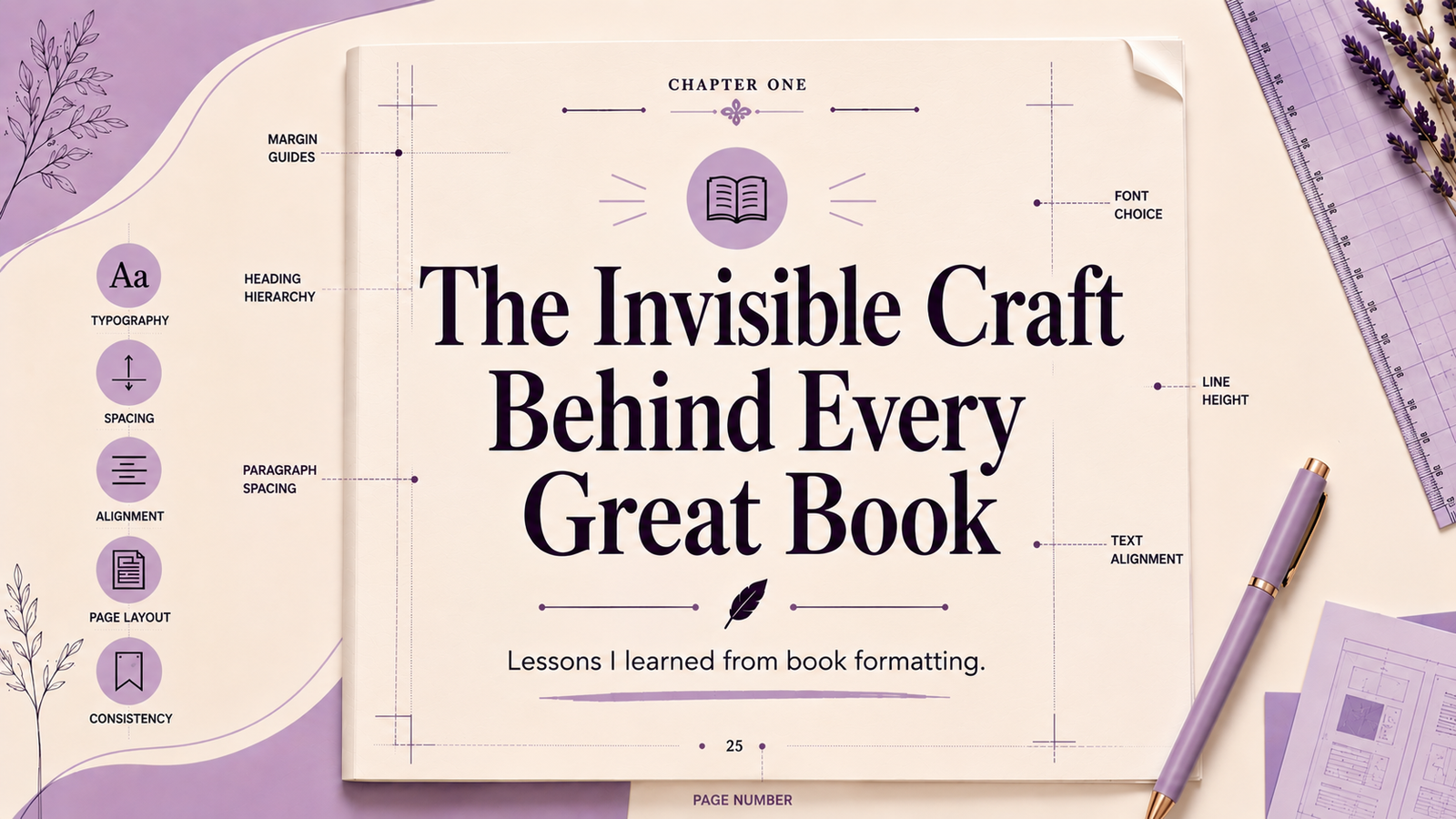
Lesson 1: Formatting Is Not Decoration, It’s Communication
One of the biggest misconception I had early on was that formatting was about making things look pretty. It’s not. Formatting is how you guide a reader through a text without them noticing you’re doing it.
Every formatting decision communicates something. Font choices establish tone. Heading hierarchies create structure. Line spacing affects comfort. Margins influence how open or crowded a page feels. Readers may not consciously analyze these elements, but they experience their effects throughout the book.
As typographer and design educator Ellen Lupton puts it:
“Typography is what language looks like.”
Ellen Lupton
That idea changed how I approached formatting. Instead of asking whether a page looked good, I started asking whether it felt easy to read. The goal was no longer decoration. The goal was clarity.
Lesson 2: Readers Only Notice Formatting When It Fails
Readers rarely notice formatting when it is done correctly. They only notice it when something feels wrong.
A reader may not be able to explain why a page feels uncomfortable, but they can sense when something is off. Inconsistent spacing, crowded paragraphs, awkward margins, or irregular formatting patterns create friction that pulls attention away from the content.
This taught me an important lesson: formatting works best when it stays out of the way.
When readers finish a chapter without thinking about the layout, the formatting has done its job. The focus remains where it belongs—on the ideas, the story, and the reading experience itself.
Lesson 3: Consistency Is More Important Than Perfection
Early on, I spent far too much time searching for perfect design choices. The perfect font pairing. The perfect heading style. The perfect spacing.
Eventually, I realized that readers are far more likely to notice inconsistency than imperfection.
A formatting system does not have to be flawless to feel professional. It has to be consistent. When typography, spacing, alignment, and structural elements follow clear rules throughout a book, the entire reading experience feels more intentional.
Designer Charles Eames captured this idea perfectly:
“Details are not details. They make the design.”
Consistency tells readers that every detail has been considered. More importantly, it builds trust
Lesson 04: Print and digital are two different books
One lesson that surprised me was how differently the same book behaves across formats.
A print book exists within fixed dimensions. Every page appears exactly as intended. An eBook, on the other hand, adapts to different screen sizes, devices, and reader preferences. What works perfectly in print may not work at all in a digital environment.
Understanding this changed the way I approached formatting projects. Instead of treating digital formatting as a simple conversion process, I started viewing it as a separate stage with its own requirements and challenges.
A book may contain the same content in both formats, but the reading experience is not identical. Each version deserves its own attention.
Lesson 5: Simplicity Often Looks More Professional
At first, it can be tempting to overdesign pages with excessive styling, decorative fonts, or complicated layouts. The more examples I studied, the more I noticed that professionally formatted books usually follow simple and clean structures.
Minimalism often creates a better reading experience.
Clear chapter openings, balanced spacing, readable typography, and organized layouts usually outperform overly styled pages.
That experience taught me:
“Simplicity is not emptiness. It is clarity.”
Good book formatting supports the content instead of trying to overshadow it.
Final Thoughts: The Reader Should Never Feel the Work
Before learning about formatting, I mostly viewed publishing through the lens of writing and editing. Formatting changed that perspective. It revealed how many invisible layers contribute to a professional final product and how much those layers influence the reader’s experience.
Publishing is not only about having valuable ideas. It is also about presenting those ideas in a way readers can comfortably engage with. Formatting influences how readers move through pages, how long they stay engaged, and how professionally the work is perceived overall.
The biggest lesson I learned is that the reader should never feel the work behind the formatting. Every decision, from margins and typography to spacing and hierarchy, should quietly support the reading experience. The moment readers stop thinking about the page and become fully absorbed in the content, the formatting has succeeded.
As UX designer Jared Spool observed:
“Good design, when it’s done well, becomes invisible. It’s only when it’s done poorly that we notice it.”
That idea perfectly captures how I now think about book formatting. The most impactful parts of a book are often the details readers never consciously notice, yet those details shape their experience from the first page to the last.